"Don't be afraid of failure, be afraid of giving up."
Wardrobe Wednesday 012
uniqlo's
MONSTER HUNTER
~ ~ ~
< CAPCOM >

From the last time I had an entry into this segment, I have actually added a lot more varieties of clothes into my current wardrobe that I even had to take them out and sort them out by colours since my actual wardrobe is overflowing now. I tried to do that rolling technique since it will be easier to go through but looking back retrospectively, putting them on top of one another just made it harder for me especially if I couldn't remember what were behind that pile or under that pile, so on and so forth. I can attribute this sudden turn of events to my inclination to keep bundle-browsing now and then and since they keep adding new selections onto the rack, there are more chances for me to find something that I am attracted to that could be added into my collection.

Surprise, surprise, I found one (and many more, but that would be kept for another day. You don't think I want to waste all of them in one post, do you? I've been quiet for quite awhile now and I don't intend to do so again for the time being). I know I have been preaching (so to speak) the same thing again and again but as I am browsing through the virtually limitless pieces of clothing, I will always emphasize quality over quantity, trying to find those with high grade textiles and smart designs applied upon them, not just random low grade brandless thingies!


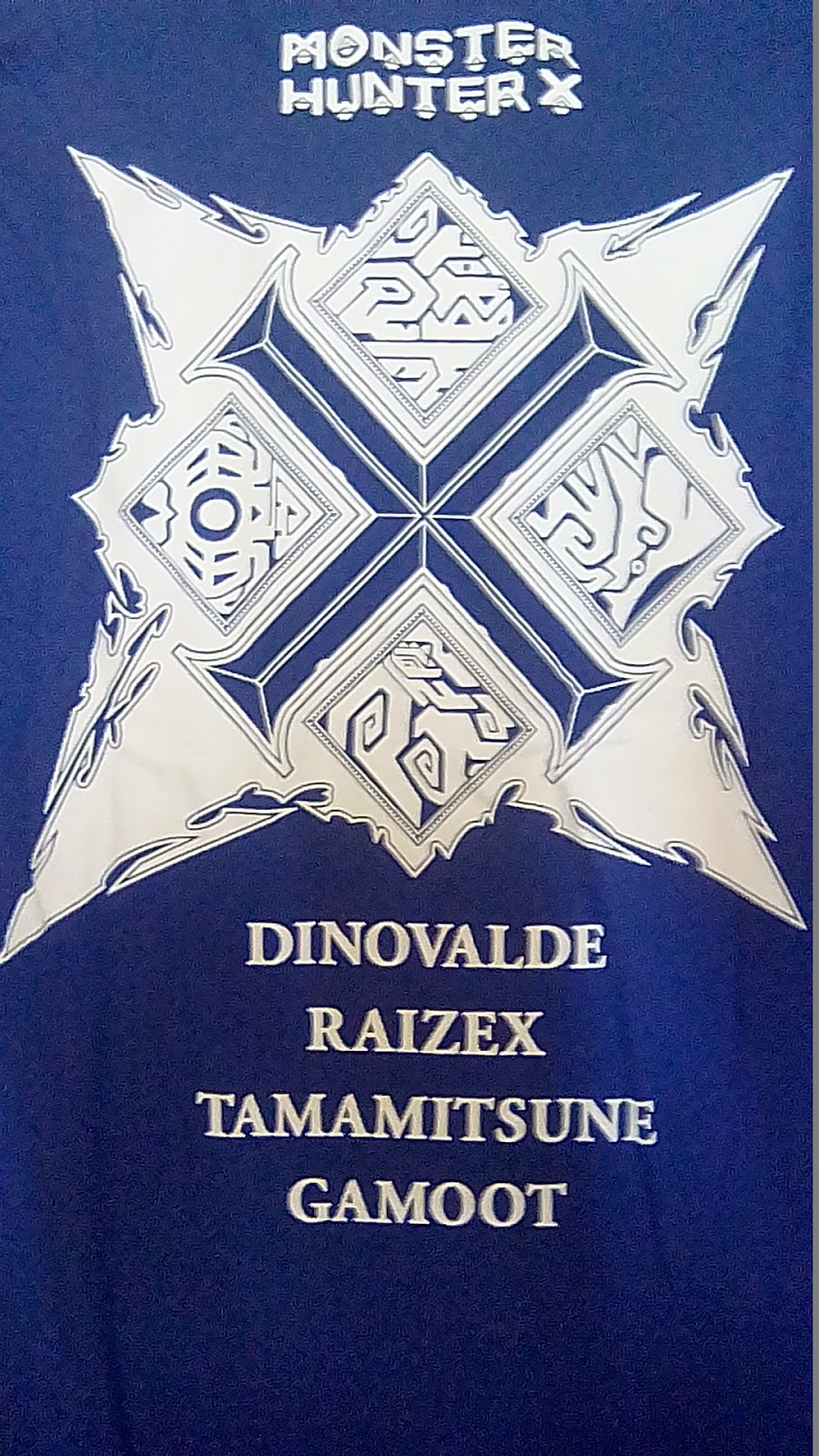
With that being said, the one brand that I keep return to (for good reasons of course) is uniqlo and I hope you are not bored of it just yet since there are many more in my disposal. This one is particular is based upon the popular Japanese game franchise, Monster Hunter, and even though I haven't play it yet myself, I can always appreciate brilliantly designed shirts that are actually proper merchandises for certain pop culture properties! With that simple primary blue colour as a solid background to work on, the beautifully ornate white crest at the back and the logo at the front just pops out, especially on top of that handy pocket! I can't believe not more shirt out there would have a front pocket, if it is applied properly. My favourite part is actually the simple logo below the shirt tag. When I do get my hands on the game itself, I can appreciate it on a whole other level!

-
a case for the cleanly designed shirt:
+ Positives +
Cleanly designed, eye-catching contrasting colours and that pocket though!
~
Oh, that handy black tag at the side of the pocket in case you couldn't read the one at the back ...
The ornate approach certainly teases of how the game visual actually is since you're not seeing it here.
- Negatives -
I might not have a personal connection with the IP but that would be a joy to make later down the line.
RM
RM 18? Yeah, at the same place again as most of the entries before. I'll keep coming back for more as long as they keep providing me with materials to work with!
? Value ?
+ design + slim fit + ornate + game merchandise + pocket! - no personal tie = 80%.
--
- x -


No comments: