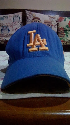
a throwback design unlike any others ...
Wardrobe Wednesday 022
LA Dodgers retro cap
< new era >
It's been awhile ... after focusing on shirts for the most recent entries, I want to go back to caps for a change since I do have newer ones to share with you.
New Era has gone for a few decades now as an American apparel company and it has gone through quite a few transformations specifically their signature designs, going from the big and flashy to the more streamlined and minimalistic. Although the latter is the more popular now and more widely accepted, I can find a lot of charms from the former, as a retro trip that I could get behind!
This cap in particular is a perfect example of their previous design practice with the bold colour pairing of light blue and bright orange (I'm not sure whether or not this tied into the club's jersey or just random circumstance ... probably the former, again) and the giant sewn emblem or crest on the left side of the cap. I can't be sure when exactly this edition came out since the tag is already turning invisible but I love the throwback designs from the elastic band lining the inside to the stitched in Dodgers at the base of the bill, certainly my personal favourite aspect of the overall design! While the more recent works focus more on aesthetic, their earlier efforts focus more on comfort which can be seen from the plastic band, although it have to compensate with the overall shape of the cap. Each approach has its own pros and cons with old being more diagonally while the new being more xyz visual-wise ... do you get what I mean? The new ones have more heights while the old ones have width from the front to the back. Each design would appeal to different demography but I am fond of both actually!
What do you think? Do you have your own preference from newera specifically or more broadly in general?
-
a case for the bright neon throwback:
+ Positives +
beautiful and bright cap brilliantly designed with a number of standout design choices.
? Main contention ?
I wonder what other design that I could come across from the yesteryears ... suffice to say I'm looking forward to it!
- Negatives -
the ravage of time is just too strong to be totally avoided as the materials and form of the cap couldn't keep their original forms ... but it's still in exceptionally good condition considering how old it is!
RM
Above RM20 if I remember correctly, and it is worth every ringgit.
? Value ?
+ vibrant design with eye-catching emblem and embroidery + perfect and beautiful contrast of colours - slight wear and tear + elasticity + quality materials still holding up ... = 95%.
--
- x -


No comments: